EZRentOut provides the ability to generate graphs and tables from Custom Reports so you can easily interpret large data sets and extensive reports. Now you can export graphs and tables onto your dashboard for insightful and instant visualization of key business operations. Select the report most relevant to you and get visual data right when you sign in.
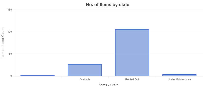
For example, as a business admin, you have to continuously keep track of Items that are rented out, available, or under maintenance. With the ability to add Graphs on the Dashboard, you can simply save weekly reports and view the linked Graph when you sign in. Here’s an example of ‘Number of Items by state’ graph:

Creating a Custom Report
You will start with creating a custom report as per your needs. For example, here we have run a custom report for Items for Orders and Groups module. The rows are grouped by Items-state in descending order.
Read more: Generating Custom Reports in EZRentOut

Creating a Custom Graph
While creating a custom report, you can also create a relevant graph by clicking on the Create graph button on the custom reports page

You can select graph types, plot on the horizontal and vertical axis, and set graph titles as per your requirements. An example of a bar graph is plotted below. Here are Steps 4 and 5 from the report above where we have selected Items state and the Items counts respectively.

Once you hit preview, a bar graph will be shown for these values. As you can see, more than 100 Items are rented out

Read more on how to generate different types of graphs, here
After you have finalized your report and its graph, hit the save button and enter a report name. Select the option to save the graph along with the report.

As you click save, an overlay will appear asking you to Add to Dashboard

Add graphs from the Dashboard
To add saved graphs directly on the dashboard, Go to Dashboard and click Edit
Hit the Add/Edit widget button and select ‘Add graphs from Custom Reports’ at the bottom left of the window:
You can select your saved custom reports from the dropdown and preview saved graphs on the right side as below:
If you don’t have any saved reports, you can also create custom reports to display directly from the Add/Edit Widget button.
The graphs will look like this on the Dashboard
Pie charts and bar charts will appear in the following sizes on the Dashboard
Add Tables from the Dashboard
You can also add Custom Reports Tables to Dashboard. Please Go to Dashboard → Edit → Add/Edit Widgets → Add graphs or table from Custom Reports
A new window will appear to choose a Report for exporting Tables.
You can select the columns you want to display in the Table on the Dashboard.
Note: Users can’t remove the columns which are essential for the report e.g. columns on which grouping is applied
Once you have selected the required columns, click Add and your Table will be visible on the Dashboard.
Note: Removing a column from the main report will also remove the column in the table widget, once the table widget is refreshed/reloaded. Similarly, any update in the Table on the Dashboard will be updated if new columns are added to the original Report.
Alternatively, you can also add the Report Table by going to the Navigation Menu → Reports → Custom Reports → Add to Dashboard.
The tables will look like this on the Dashboard
About EZRentOut
EZRentOut, a cloud-based equipment rental software can help. EZRentOut offers companies in numerous industries seamless rental management along with a host of other features. You can integrate your website with our EZR plug to keep track of all your rental Assets and operations.


